With the start of the new semester, so begins new blog entries. This semester will be focused on music videos. As I thought about why I chose to take this class I have realized that music videos are one of my favorite art forms. They combine music and visual storytelling which are two things I really enjoy. As this is the first blog post here are some fun facts about me...
I love sports, especially baseball and football
My favorite genre of music is country, but I have a little bit of everything on my iPod
My artistic style is fun and colorful, but I also have a serious side
Here are some videos that stood out to me
The Script - For the First Time
This video is made using footage from the short film For the First Time by Charles Meling which used the song. I liked the style of the short film and the blending of the narrative story with the artist performing the song.
Nelly - Over and Over ft. Tim McGraw
I found this video to be interesting in that it combines two artists who are vary different from each other. I like how Nelly and Tim McGraw are doing the same actions, but in settings that represent their backgrounds, Nelly being from St. Louis and representing his urban upbringing and Tim McGraw as a country artist and the lifestyle that goes with it.
Nelly - Just a Dream
I like this video because of the artistic way it was shot. The shots of the water, the car floating in the air, and the ring spinning in the surf all seem like strange elements to combine but it all comes together in an interesting and creative way.
Sara Evans - A Little Bit Stronger
What stood out to me the most about this video was its simplicity. It is elegantly shot and helps convey the message of the song. Also a friend of mine pointed out that everyone can relate to this video at some point in their lives.
Faith Hill and Tim McGraw - Like We Never Loved At All
This video is like a short film of the story the song is telling. This video shows one thing I love about country music, that every song has a story that is being told with music. A music video is the perfect way to put that story into visual terms.
Let's Go To The Movies...
The blog of a film student with big dreams.
Monday, January 17, 2011
Wednesday, December 1, 2010
Demo Reel
While thinking about my demo reel I decided to use some of the best shots I had from projects I have directed and been a DP for as a TCF student. It reflects my love of quirky characters and some in camera special effects. I wanted to have fun with this real and it was important to me that it have personality.
Where do I go from here?
Its the end of TCF 312 and I have gained more knowledge that will improve my skills as a film-maker that I thought I could in one semester. Before this class I had experience with only a basic camera and was used to using the natural light of my surroundings, which wasn't always the best results. One of the most valuable tools I have taken away from this class is how to use and control light. This was also the first time I had worked with a crew that were given specific jobs and were restricted to those jobs. Previously it had been a group of three or four people who did everything. Also I learned how to communicate the ideas I had in my head to the crew to create that image on screen. I have enjoyed the opportunity to work with and also learn from so many talented people and am going to take this experience with me as I continue to learn and develop my skills as a film-maker and vision as an artist.
Artist Statement
For as long as I can remember there has been a camera at every family gathering, sports game, dance recital, school event, ect. I developed my interest in film-making from watching these home movies and having a desire to make them more interesting and artistic.
I take inspiration from everything from classic Hollywood films to homemade YouTube videos. Characters are a driving force in what inspires my work as well. A picture can create a mood and feel of a story, but it is the characters that truly bring the story to life.
As a filmmaker my goal is to entertain my audience by bringing them into the world of my characters. Color, lighting, movement, and music are tools I love to use because they are elements that have always captured my interest in other films.
Scene Assignment
I chose Animal House because it is a character driven comedy that is funny because it doesn't try to be. The quirky characters make the audience want to join in the fun of the members of Delta House. The thing I took away from this the most was not only how to use light to convey the message of the scene, but also to know your equipment. The lights I used were borrowed from another group and ended up being too strong for the confined space I was working in. A special thanks to my cast who stepped up at the last minute.
Scene Analysis, what makes a great scene
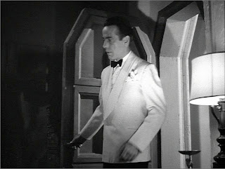
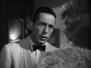
For my scene analysis I decided to use one of my all time favorite movies, Casablanca directed by Michael Curtiz and cinematography by Arthur Edeson. It is a film that has been referenced in books and documentaries on cinematography and in my mind on the the best films ever made. Lighting and composition is an essential part of creating a great scene especially in early black and white films. The limitations that technology placed on filmmakers required them to use lights to create the mood, tone, and any effects. Arthur Edeson uses light to create art on film using soft and hard shadows and the classic soft glamor focus.
The scene I chose was when Ilsa goes to Rick to get the signed letters of transit so that she and her husband Victor can leave Casablanca and make their way to Lisbon to continue his work with the Resistance.
 The first shot is of Rick walking into the room and turning on a light to find Ilsa. The table lamp gives the illusion of being the only light source, but Edeson uses a fill light to balance out the shadows created by the table lamp.
The next shot is a full shot of Ilsa standing near the window. Light is used to create the illusion of moonlight coming in through the window which also gives an artistic element in the shadows given by the framing on the windows.
The bust shot of Ilsa uses soft shadow to create a sense of mystery
 A shallow depth of field and the primary light coming from the window side of the shot, which maintains the illusion of moonlight, create separation between the subjects and the background and gives more dimension to the subjects.
By shooting from the shadow side of the subjects, the lighting creates a sense of tension between Rick and Ilsa.
The scene I chose was when Ilsa goes to Rick to get the signed letters of transit so that she and her husband Victor can leave Casablanca and make their way to Lisbon to continue his work with the Resistance.
 The first shot is of Rick walking into the room and turning on a light to find Ilsa. The table lamp gives the illusion of being the only light source, but Edeson uses a fill light to balance out the shadows created by the table lamp.
The next shot is a full shot of Ilsa standing near the window. Light is used to create the illusion of moonlight coming in through the window which also gives an artistic element in the shadows given by the framing on the windows.
The bust shot of Ilsa uses soft shadow to create a sense of mystery
 A shallow depth of field and the primary light coming from the window side of the shot, which maintains the illusion of moonlight, create separation between the subjects and the background and gives more dimension to the subjects.
By shooting from the shadow side of the subjects, the lighting creates a sense of tension between Rick and Ilsa.
Portrait of a Place
I learned a lot from the portrait of a place assignment. First and foremost planning and communication with my director of photography are essential for a good project. A time conflict forced me to come up with a backup plan for this assignment and caused my work to suffer. Also trust in your cinematographer is key, but you also need to make sure they are doing what you are asking them. I had a problem with not knowing that the white balance was not set correctly until I was editing and was up against a deadline with out time to re-shoot. This experience has definitely been useful in my development as a director and has shown me I still have a lot to learn.
Subscribe to:
Comments (Atom)


